
“More than 714,000 young people have registered to vote since Theresa May called for a snap election” begins a recent Independent article, before it goes on to speculate gently about what this might mean for Labour’s chances next week. A BBC article similarly makes the claim that: “More than two million people have applied to register to vote” in the same period of time.
They haven’t though. Significantly fewer under 25s had registered to vote when that piece was written. I have no idea how many, but I will bet you good money that the number reported by the Independent is wrong, dramatically so. And the BBC article has also got the wrong numbers for people who’ve applied to register to vote. They are slightly closer to the truth in their wording, but applicants are not applications and what they want to say is that two million applications to register to vote had been filed. Well, they don’t want to say that obviously, because that isn’t very useful information at all. But alas, that is the only information they have.
You see, the authors of these and dozens of other articles in the run up to the May 22nd deadline were lured into a false sense of data precision by the government’s Voter Registration Dashboard. And who could blame them when they have found a sleek (almost) mobile friendly website with interactive charts look like exactly what they are after: daily statistics on newly registered voters, along with their age group to boot. But that isn’t what the dashboard is doing, and it actually says so right at the top: “[the] dashboard shows information about how the Voter registration service is currently performing”. Its primary purpose is to measure the performance of a government service. Arguably that is a quite poorly defined objective anyway, but since it is being implemented as part of an efficiency through transparency drive it is also open to the public – and all the journalists inevitably contained therein – further obscuring its prime intention; to the point of it being systematically misinterpreted almost without exception.
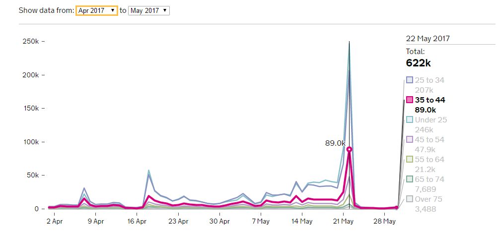
Figure 1: Don’t be fooled by the pretty graphs and precise numbers: this information is a lot less useful to you than you might think. (Source: Performance, Accessed 31.5.17)
The voter registration dashboard is only one of over 800 Performance dashboards, a data platform run by the Government Digital Service (GDS). The platform was developed as part of a push to make administrative services better – more efficient (more digital?) and its customers more satisfied. The underlying idea was to “fix transactions” i.e. to make government service providers accountable, transparent and allow them to benchmark their service volumes, costs and customer satisfaction. It is not intended, nor should it be used, to get statistics on anything other than service volumes.
Am I being a bit too harsh? Perhaps. For example this Guardian article explains that “[t]his does not necessarily equate to the same number of new voters, as some of the applications could be duplicates from people already registered”. But I don’t think this language does justice to the deep divide between the numbers these articles are reporting and the reality they purport to represent. Let me be concrete:
- According to the data collated by the ONS between 1.12.2015 and 1.12.2016 the number of parliamentary electors in the UK Electoral registers increased by 1,044,452 .
- Over the same period the Voter registration dashboard reported 9,537,918 filed applications.
That’s one million more voters versus nine and a half million applications. Yes, I know this is not saying there are one million new voters, because a good 600,000 people died in the UK in same period. But even if we assume that the deaths were all registered voters we still only had a good one and a half million new voters. Compare that to the nine and a half million applications: clearly saying that “some of them could be duplicates” is a tad too charitable.
And having established that the number of applications does not (at all) correspond to number of new voters, there is furthermore no reason to believe the number of applications corresponds to number of applicants either. What if a user’s connection timed out because they lost the signal on a train? Or they woke up vaguely remembering they started the registration process last night when they got home from the pub but can’t remember actually finishing it, so they apply again, just to be sure. Will they be counted twice? My guess is yes, but in fact I have no idea what the dashboard is reporting. Because there is no definition of variables, nor metadata or supporting documentation that would unambiguously describe which applications get counted and how.
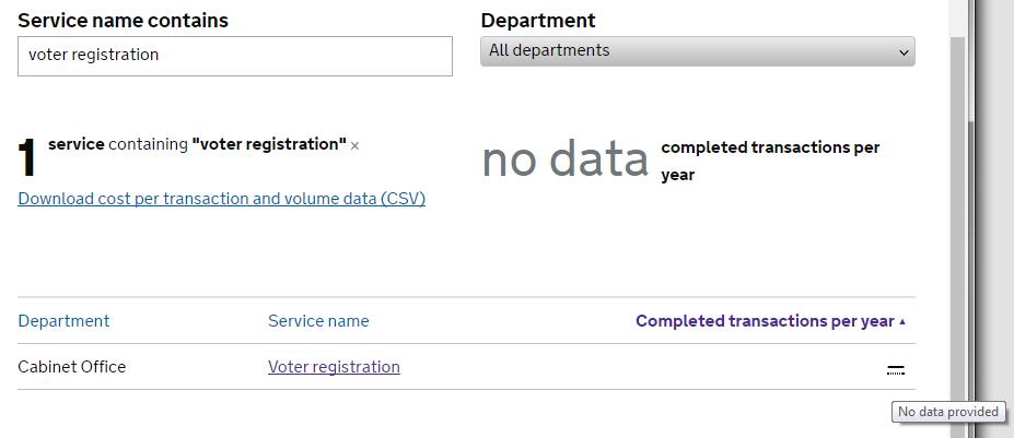
Figure 2: An actual screenshot of a search for voter registration data that returns “no data” is a rather ironic indictment of what the Performance platform offers its users (Accessed 30.5.2017)
The fact of the matter is we just don’t know how the dashboard data corresponds to numbers of new voters in each age group. And that is incredibly frustrating: lovely free and open data that is essentially impossible to interpret beyond vague statements. Yes, a surge in applications in a certain age group is strong evidence that there will be a concurrent (smaller) spike in newly registered voters, but its relative size must surely vary by age group. Some age groups are more likely to register twice by accident, others to have moved and required a new application (we don’t have any information on how efficient the register to vote service is at removing people from the registers). We simply don’t know, but we are given the false impression that we do.
The Performance platform has now been up and running for about three years (five years if we count its predecessor) and has been subject to some pretty damning criticism by the National Audit Office just a few months ago, which noted e.g. that only 118 of the 800 or so services on the platform actually publish cost per transaction data, and that there is also missing data on user satisfaction, digital take up and completion rates. The report further says there was “lack of clarity about the purpose” of the platform, which rings true to anyone that has spent more than two minutes on the website: this isn’t open data, this is an administrative data dump that masks the lack of useful information by its ostensible breadth of coverage and hallmarks of “big data”: dynamic infographics that you can hover over interactively, an API that allows you to fetch .json formatted subsets of data at your leisure (an Application Programming Interface is just a fancy way of saying the data can be exported in a reasonably practicable–although not terribly user friendly–way), and a blog that for example says eminently sensible things about reproducibility, open source tools and version control. Wonderful stuff. I am not being ironic. These are all wonderful things, but they are not enough. Administrative data has immense value for researchers, journalists and the public. Its potential needs to be recognised and taken into account when building platforms like Performance, otherwise I fear open data will be just another catchphrase on its way to becoming a standing joke.
About the Author
Dr Maja Založnik s a demographer currently working on a joint project of the Oxford Institute of Population Ageing and the Oxford Martin Programme on the Future of Food.
Comments Welcome:
We welcome your comments on this or any of the Institute's blog posts. Please feel free to email comments to be posted on your behalf to administrator@ageing.ox.ac.uk or use the Disqus facility linked below.
Opinions of the blogger is their own and not endorsed by the Institute
Comments Welcome: We welcome your comments on this or any of the Institute's blog posts. Please feel free to email comments to be posted on your behalf to administrator@ageing.ox.ac.uk or use the Disqus facility linked below.
_square_xs.jpg)


_square_xs.jpg)