The institute is about to publish the fourth issue of the journal Population Horizons which I manage editorially, but more excitingly, where I also hold the unofficial title of Graphics Editor. One of my self-inflicted tasks in this role is to prepare a factsheet for each issue, visualising some aspect of the issue’s theme.
This issue, edited by Jaco Hoffman and George Leeson, looks at the Status and role of families in ageing populations, with three papers exploring the interdependence between family members in various demographic and cultural contexts. I decided the articles would be well complemented by an overview of how household living arrangements vary for different groups across the world, and for older people in particular.
I first needed to decide what aspects of household structure I wanted to compare, but also balance those wishes with data availability. Survey data is available on various aspects of family life, but there is no harmonised data-set that would allow a cross-country comparison of the rich tapestry of people’s lived experience. Census data, despite its limitations, seemed like a good compromise in this case, especially because the IPUMS-International project collects and freely disseminates (samples of) census microdata for currently 85 countries. Census microdata has information of how each member relates to the head of the household, and this makes it easy to establish if a household is e.g. a single person, a nuclear family, or an extended household.
But what I was even more interested in was the number of generations living together under one roof. If I could see that a household had both children, and grandchildren, and perhaps even parents and grandparents listed as co-habiting, then I could count exactly how inter-generational the household was, and even see if any generations were skipped. Fortunately plenty of censuses do collect such detailed information, and I was able to select 22 countries where such data was available (I only picked the ones where data was available for this century).
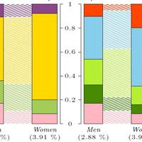
The problem with static graphics is that you inevitably need to pare down all the variables and comparisons you originally want to make, and it was no different here. I decided to focus on older people, those over 60 years of age, and focus primarily on the difference between men and women. Still, I sneakily managed to include the country-wide levels in the background. Below you can see how the Portuguese data looked on the factsheet (the description of categories is in footnote[1]).

Figure 1: Household composition of over 60s in Portugal (2011) using a kinship (left) and generational (right) typology. Country wide levels in the background. (see Detailed description of categories in footnote[1]).
I love how the chart divulges more and more information the more time you spend looking at it. The gender difference is most obvious in the proportion of older people living alone (pink): a quarter of women, compared to only 10 percent of men do so. (The widths of the bars are proportional to the number of men and women, so the ratio of female to male one person households is more than three to one.) Interestingly, on the right panel we see the proportions living in either one person (pink) or one generation households (dark green) – which are mainly with spouses – is almost identical for both genders. Comparing the bars in the front with the background also gives us an idea about how older people’s experience differs from that of the population as a whole: with regard to family nuclei it is remarkably similar, whereas the intergenerational classification shows dramatically lower rates of two generation households (bright green) and yet three generation households (blue) are just as common among older people as the general population.
Now compare that with the chart for Botswana below. This is actually the only country in my sample where the men over 60 are more likely to be living alone than the women! Botswana’s population is much younger than Portugal’s though, so the bars represent a smaller proportion of the overall population (around three and four percent respectively). We also suddenly notice the red bars representing people living in households with skipped generations – 10 percent of older men and almost 20 percent of older women live in such households in Botswana.

Figure 2: Household composition of over 60s in Botswana (2011) using a kinship (left) and generational (right) typology. Country wide levels in the background. (see Detailed description of categories in footnote[1]).
Plotting all the 22 countries on one big poster-sized factsheet is all well and good, but I thought I would go one step further and create an interactive visualisation of the data. This way you can pick and mix your variables of interest and comparisons. The graphic design isn’t super sleek—and not particularly useful on a smartphone I’m afraid—but it does the job and if you click on the image below (or use this link) you can try for yourself (just give it a second or two to load).

Figure 3: Screenshot of web app for interactively exploring household structures from my database – click through!
Interactive and dynamic graphics such as this one are actually not that difficult to build—I built this one using shiny, which is an R package that makes building and deploying interactive apps directly to the web remarkably easy[2]. But they are even more satisfying to use to explore the data: at your own pace and without having to make limiting decisions such as with static charts. You want to compare two different countries? No problem. More interested in people under 60 than over 60? Simply use the drop down menu to switch between the two. Of course the danger is you will end up with more questions than answers, so be warned!
[1] UN Typology – the household composition based on family nuclei:
- One person household – A single person living alone.
- Nuclear household – a couple with or without children, or a single parent.
- Extended household – members beyond the family nucleus are related by blood or marriage.
- Composite household – other persons are present who are not related to the head.
Intergenerational structure of the household:
- One person household – A single person living alone.
- One generation household–at least one more person of the same age group as the head. Usually a spouse, but can also be sibling etc.
- Two generation household–at least one more person one generation younger/older than the head. Usually child(ren), can also be parent etc.
- Three or more generation household–at least two more persons of different generations than the head (but without skipping generations).
- Skipped generation household–at least one generation missing. Usually head with grandchildren but without children.
[2] At Oxford we further have the Interactive Data Network, which is dedicated to helping academics build such visualisations of their research data, and also provide free web hosting!
About the Author
Dr Maja Založnik s a demographer currently working on a joint project of the Oxford Institute of Population Ageing and the Oxford Martin Programme on the Future of Food.
Comments Welcome:
We welcome your comments on this or any of the Institute's blog posts. Please feel free to email comments to be posted on your behalf to administrator@ageing.ox.ac.uk or use the Disqus facility linked below.
Opinions of the blogger is their own and not endorsed by the Institute
Comments Welcome: We welcome your comments on this or any of the Institute's blog posts. Please feel free to email comments to be posted on your behalf to administrator@ageing.ox.ac.uk or use the Disqus facility linked below.