
I was recently invited to sit on a very intriguing panel on the future of data visualisation, organized by the Academic Research Support team at Oxford IT Services. The #datavizox event aimed to bring together researchers and publishers, bridging the divide between the world of academia and that of the media. It was not being to coy about what might best accomplish this task, placing it right there in the title: The Missing Link in Publishing: Interactive Data Visualisation.
I will likewise confess from the start that I am one of those people who have already made up their minds: I say make dataviz for the sake of dataviz. The more interactive, the better. Of course communicating information is important, but there is something essential and beautiful about data displays that makes them worthwhile even if there is no one interested in being their audience. This is of course just my way of justifying all the effort I spend on dataviz – which I incidentally do not recommend researchers generally do for themselves.
But one reason why all this energy might be especially wasteful emerged from a pattern I noticed from the non-academics presenting: the award winning Financial Times data journalist John Burn-Murdoch, the BBC’s Data Journalism Editor John Walton, and Rob Fry, who is head of Data Visualisation at the Office of National Statistics. All three showed us examples of their most popular work in interactive data visualisation and they all had one thing in common: they all “put the reader in the story”. Whether it is by letting them type in their electoral ward in an interactive election map, or their BMI to find their Olympic Body match (mine is the Italian épée fencing world champion Paolo Pizzo) or how many hours of cooking and cleaning they do each week to calculate the value of their unpaid work using this ONS calculator (mine is almost £5,000 a year I’ll have you know!), people want to know how they fit into the story. Remember when Google street view first came to your city, and you looked up your own house? Apparently it’s all like that, people look themselves up, but otherwise they just don’t engage.
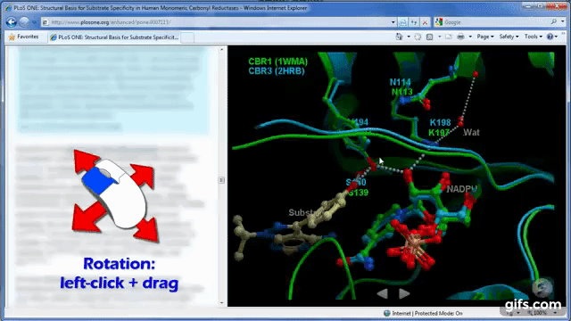
Figure: interactive protein structures for academic publishing (from this video)
It would be funny if it weren’t tragic: while interaction enables people to adjust a visualisation to their own needs and ask it different questions, it seems our own needs are basically just narcissistic. So what should we do with that information in academia? What does that mean e.g. for the work of Brian Marsden’s group on visualising structural biology data using the iSee platform (see gif above) or for Alfie Abdul-Rahman’s work visualising poetry using the Poem Viewer (see figure below), or the example from my last blog post interactively exploring household structures across the world. These examples are not set up for the sort of personalisation that today’s audiences seem to require.
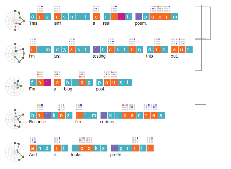
Figure: (non)poem visualisation from Poem Viewer
And the personalisation is only half of the story. Data journalism is already dealing with the idea that interactivity may not be all it’s cracked up to be. After an initial flurry of activity the idea has already been fielded that interactivity might even be dead in this 2016 video by New York Times graphics editor Gregor Aisch (who later qualified his position slightly). Why is it falling out of favour? Interactive graphics are time consuming to create, people’s screens are getting smaller and smaller, so they cannot appreciate them fully, the graphics have to work on multiple platforms which is expensive to develop, test and maintain, and most tragically: people simply are not interacting with them. It seems the scrolling motion is the maximum level of interaction readers will bother with (but don’t underestimate the power of a good scroll visualisation). The NYT apparently saw only 10 to 15 percent levels of engagement with even simple interactivity that required readers to click a single button to flip between two different views of the data.
Luckily, Gregor Aisch ended his talk on the death of interactivity by saying “I just don’t care about the reader”. He loves beautiful, complex data visualisations and I hope he gets to continue making them, even if it’s only for the benefit of a few nerdy connoisseurs. I am not that pessimistic about the future of academic interactive visualisation either. Unless we give in to the pressure of impact and outreach that uses click through rates and likes on social media, our audience is different. Our audience is not after a shallow and entertaining interaction scrolling on a smartphone, although there is nothing wrong with that, just to be clear. It is looking for a deeper engagement with the data that is not obviously or immediately relevant to themselves. And for this interactive data visualisation can be tremendously useful, allowing us to explore our data and communicate it within our fields and yes, perhaps even wider. But just in case I am being naïve and this audience doesn’t actually exist, well, like I said, you should still do it, do it for its own sake.
About the Author
Dr Maja Založnik s a demographer currently working on a joint project of the Oxford Institute of Population Ageing and the Oxford Martin Programme on the Future of Food.
Comments Welcome:
We welcome your comments on this or any of the Institute's blog posts. Please feel free to email comments to be posted on your behalf to administrator@ageing.ox.ac.uk or use the Disqus facility linked below.
Opinions of the blogger is their own and not endorsed by the Institute
Comments Welcome: We welcome your comments on this or any of the Institute's blog posts. Please feel free to email comments to be posted on your behalf to administrator@ageing.ox.ac.uk or use the Disqus facility linked below.
_square_xs.jpg)


_square_xs.jpg)